I have a confession to make. I love watching Gilmore Girls just a little bit too much. I’ve watched all 7 seasons several times. Watching with friends, watching alone, watching with a bowl of snacks, you name it. I’ve done it.
So when Netflix announced a new season of Gilmore Girls, almost 10 years after its original run, I was excited. To say the least. I’m sure this anticipation was helped along by Netflix’s rather comprehensive (and well done) post-launch marketing campaign.
The big night found me at my friend Shauna’s house with 9 other women and 1 young gentleman (go, Ben!). The lights were low, the coffee pot was brewing, 3 kinds of pizza and 20 unhealthy snacks were scattered across the living room. We were ready.
The first episode of the four started off with these three words: “I smell snow.” Good thing someone caught Shauna before she hit the ground in a swoon (ok, so that’s not exactly accurate, but definitely what I picture having happened). It turns out that’s her favorite line in the whole seven seasons.
Lorelai Gilmore, Rory’s mom to you newbies out there, has a thing for Christmas. For winter. But especially for snow. To be honest, I’d noticed she liked it but didn’t know how deep it went until I started looking into it. She’s obsessed.
So I spent a few hours the other night designing. Oh, I miss designing. I used to design websites, ads, emails, and other such things almost every day for work. But with promotion comes a different set of responsibilities. Phooey.
Digressions aside, I knew Shauna would like something with “I smell snow” on it. And it just so happens that the opening credits for episode 1 of the new season showed falling snow. And words. A pretty perfect combo as far as I’m concerned.
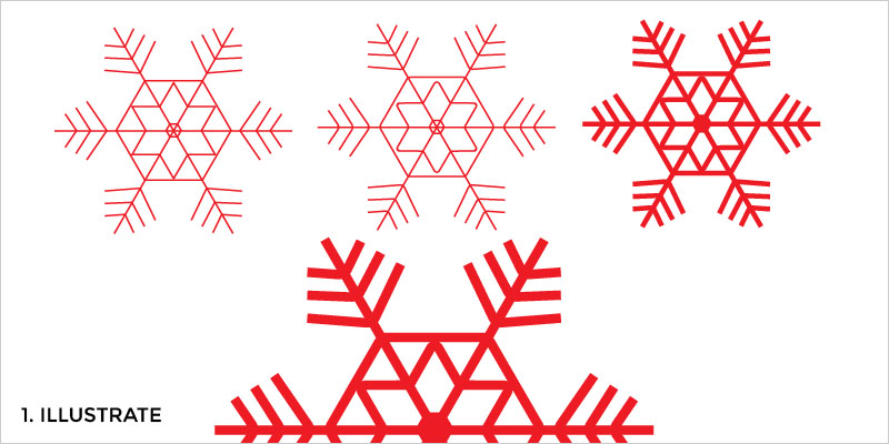
I started by recreating the snowflake shape from the Gilmore Girls intro in Illustrator.
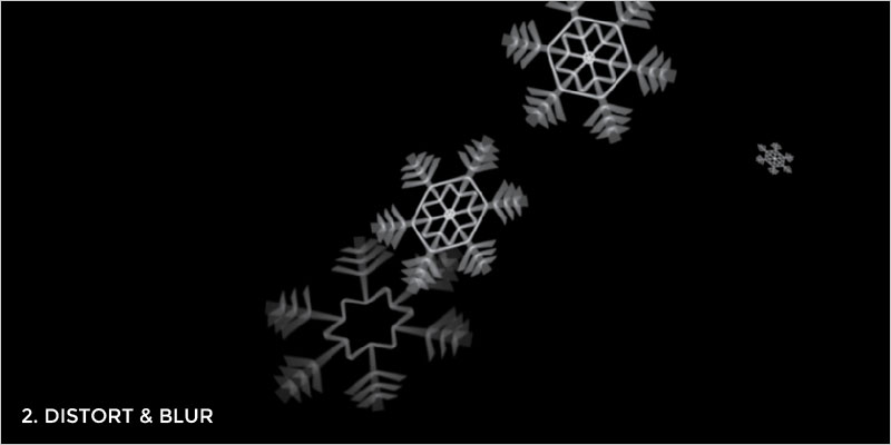
Once that was done I copied and distorted it to get something similar to what the Winter screen had. Lots of finessing happened here.
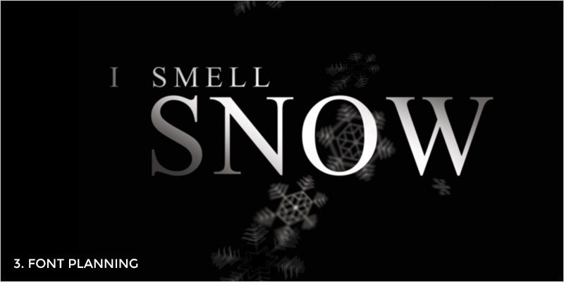
I tested the font to see what was used for the intro, only to find out it was Times New Roman with a bit of extra character spacing. It piques my interest that the original designer chose the font that’s been on every OS known to man since the dawn of time. Madness? Or magic? You decide.
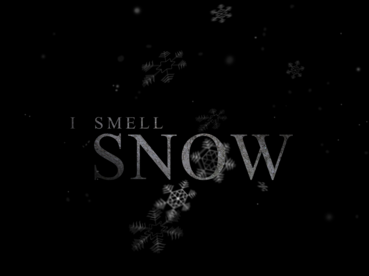
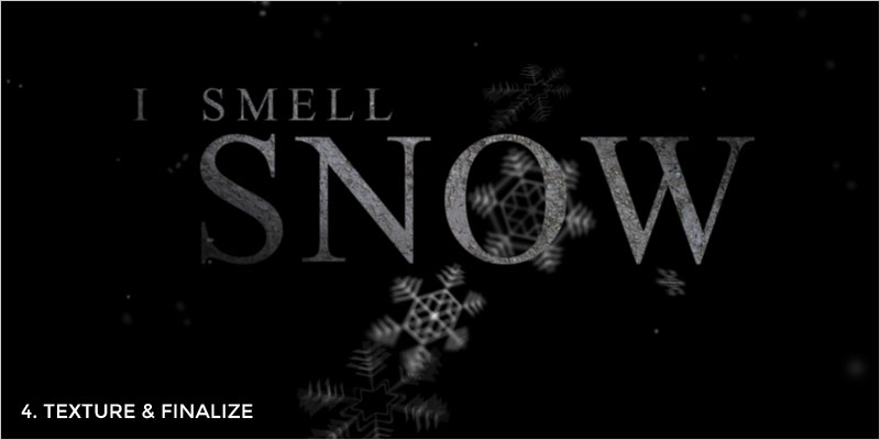
I’m not a big fan of text effects in Illustrator, so I moved it over into Photoshop. There I added texture to the letters, faded them out at the edges, and made the snowflakes a little blurrier. I ended up using several different blur effects to get the look I wanted, but after lots of tinkering, it was coming together. The last step was to make the other ‘snowflake’ dots surrounding the design. These were done through several layers of varying opacities featuring soft-edged circles made from the paintbrush.
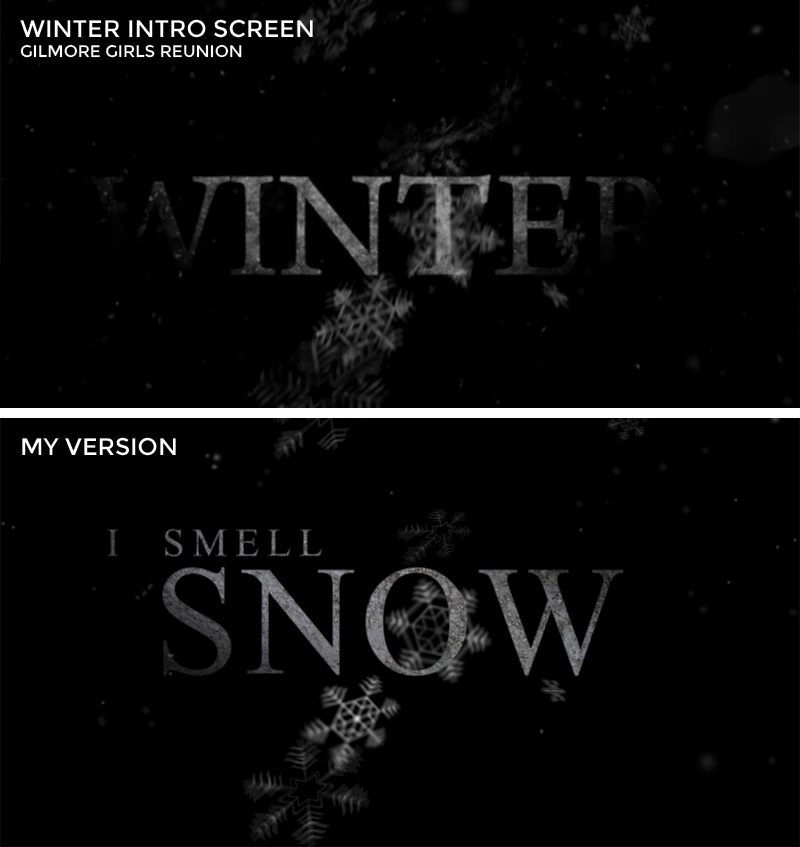
Here it is, the inspiration versus creation. Not bad for an evening’s work:
And because I’m so nice, I’m providing it as a download for your desktop or phone wallpaper. Wait, did I just call myself nice? How embarrassing.

